All work
Brand identity
Scoop
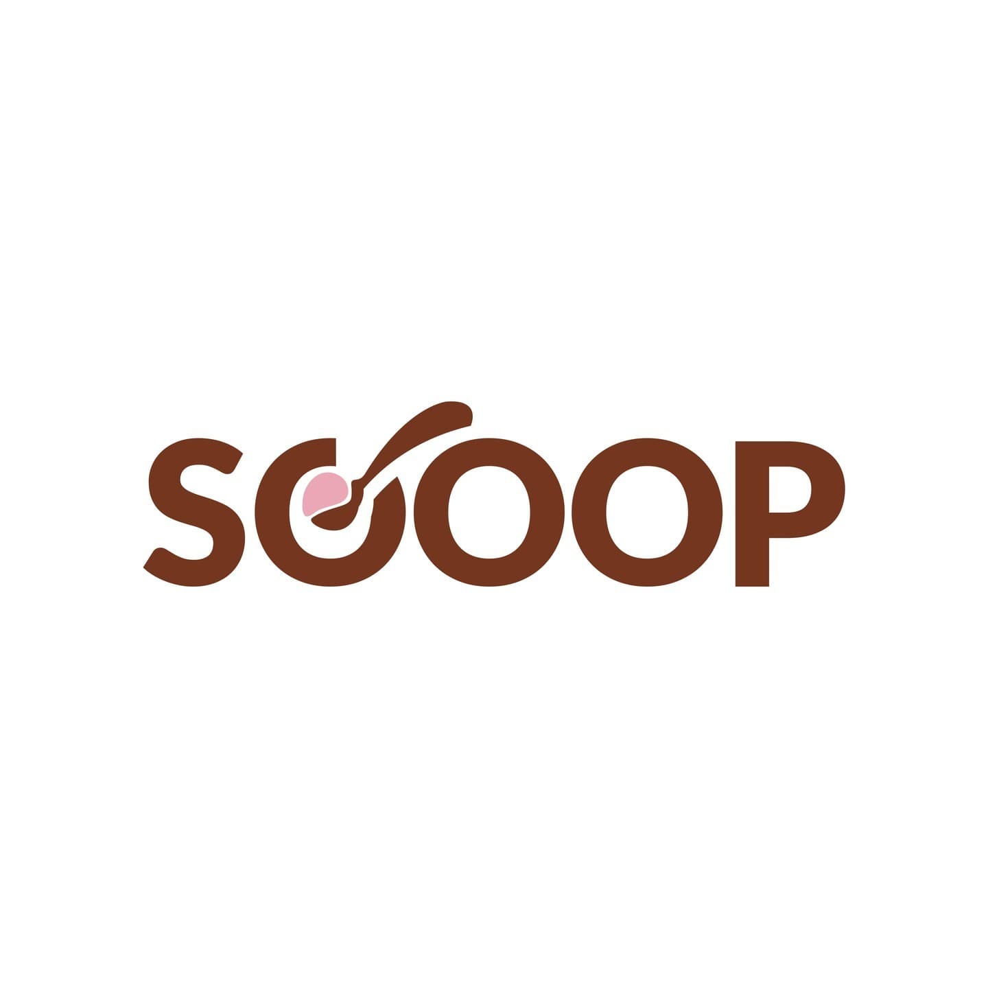
A sweet, playful identity for an ice cream brand, with a spoon and a scoop hidden in the logo.
- Client
- Scoop
- Discipline
- Brand identity
- Year
- 2023
- What we did
- Logo, Packaging, Stationery, Food and drink
Scoop's wordmark hides a spoon dipping into a pink scoop of ice cream inside the first O, so the name and the product become one.
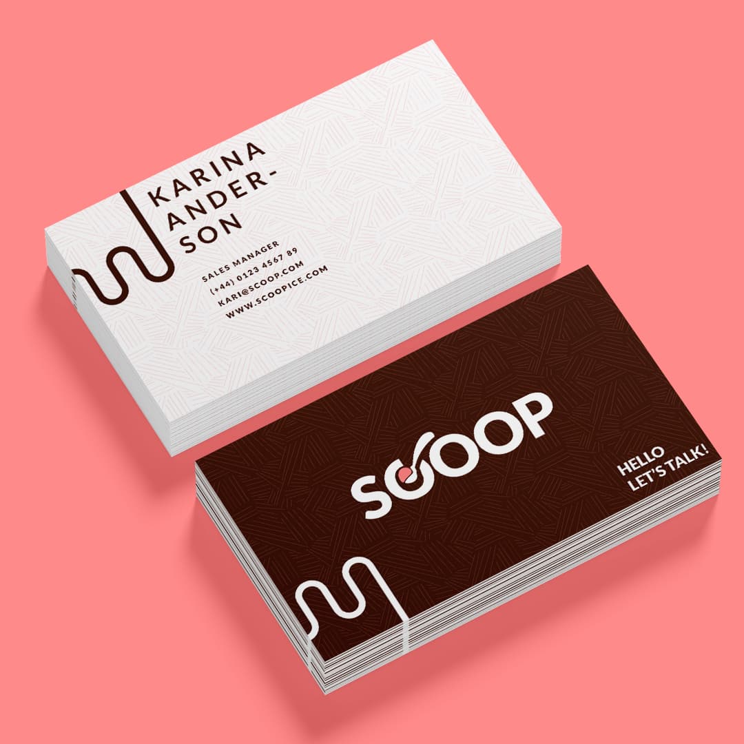
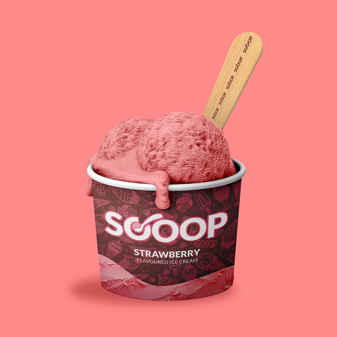
Chocolate brown and strawberry pink make it feel good enough to eat. We carried the system onto cups, wooden sticks and business cards with a drippy line pattern.