Ngepe
A brand identity for a Kenyan ticketing platform, built on one idea: the moment a plan turns into motion.
- Client
- Ngepe
- Discipline
- Brand identity
- Year
- 2026
- What we did
- Logo, Brand guidelines, Typography, Colour palette, Tone of voice, Ticketing
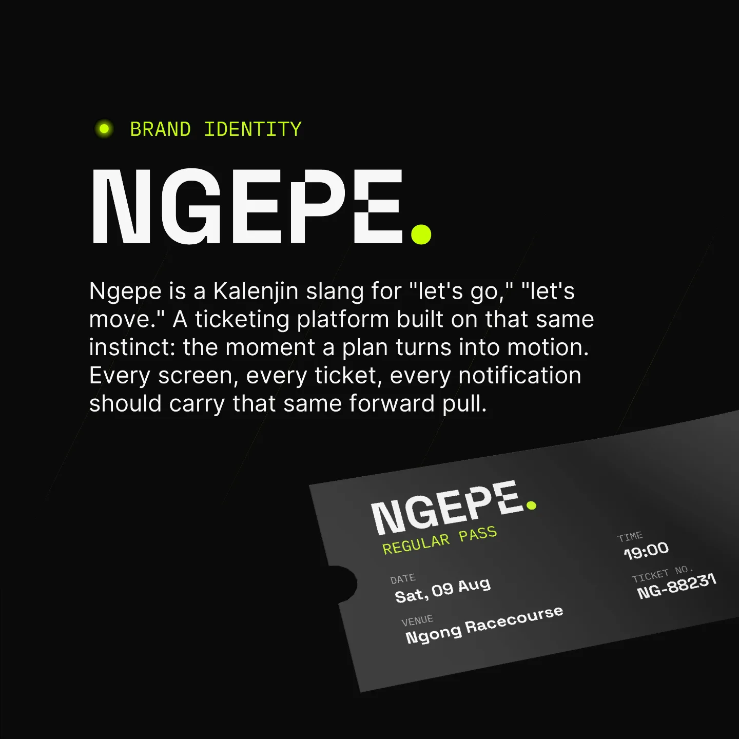
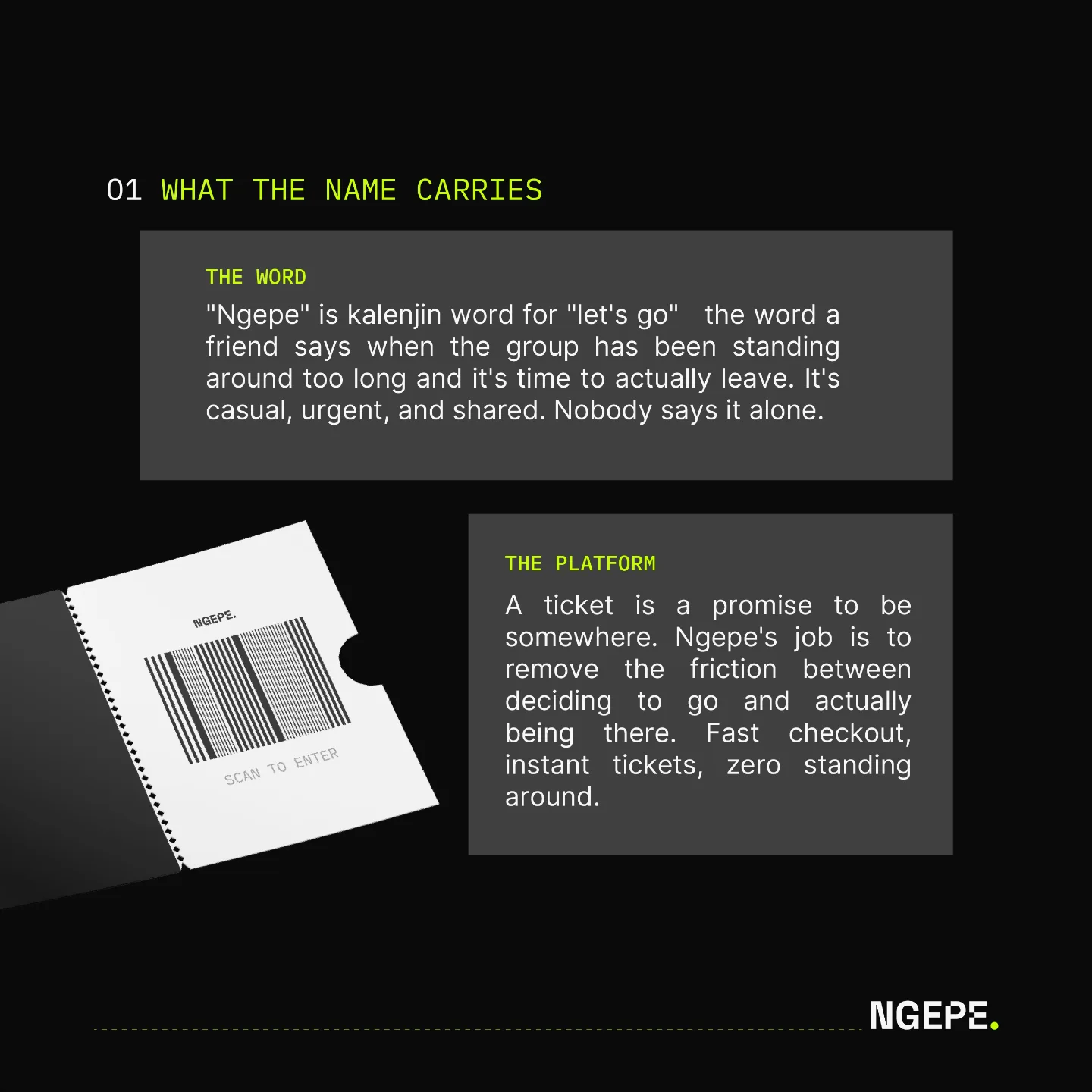
Ngepe is Kalenjin slang for "let's go", the word a friend says when the group has been standing around too long. We built the whole identity around that push: a ticketing platform whose job is to remove the friction between deciding to go and actually being there.
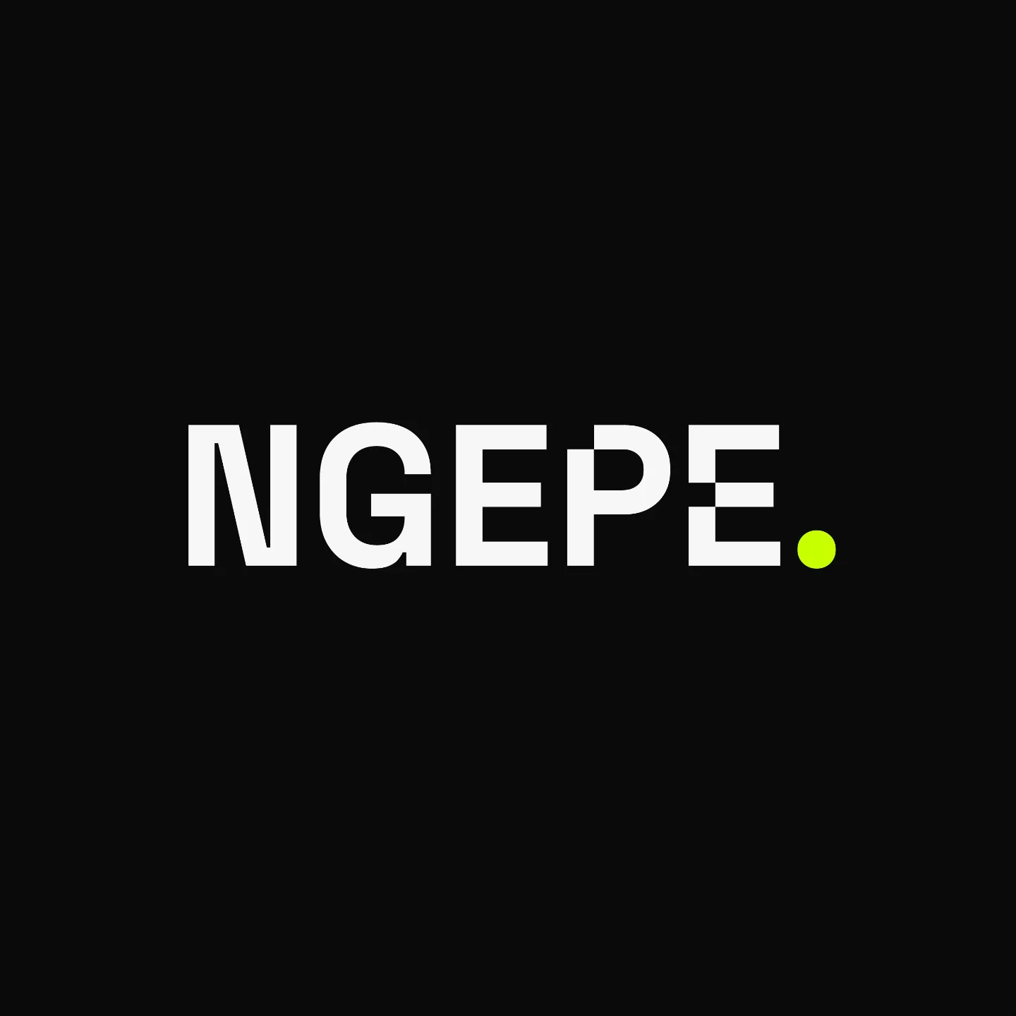
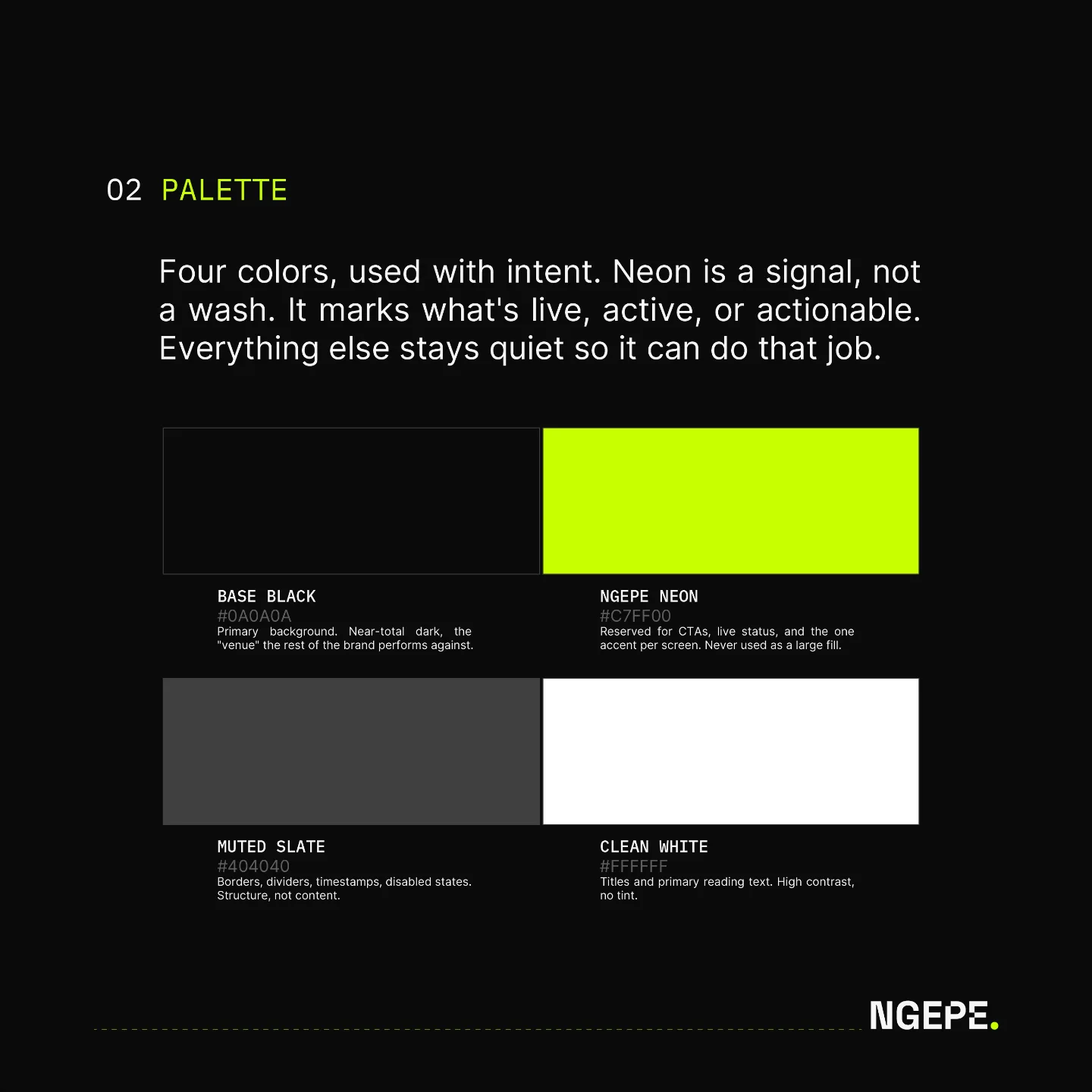
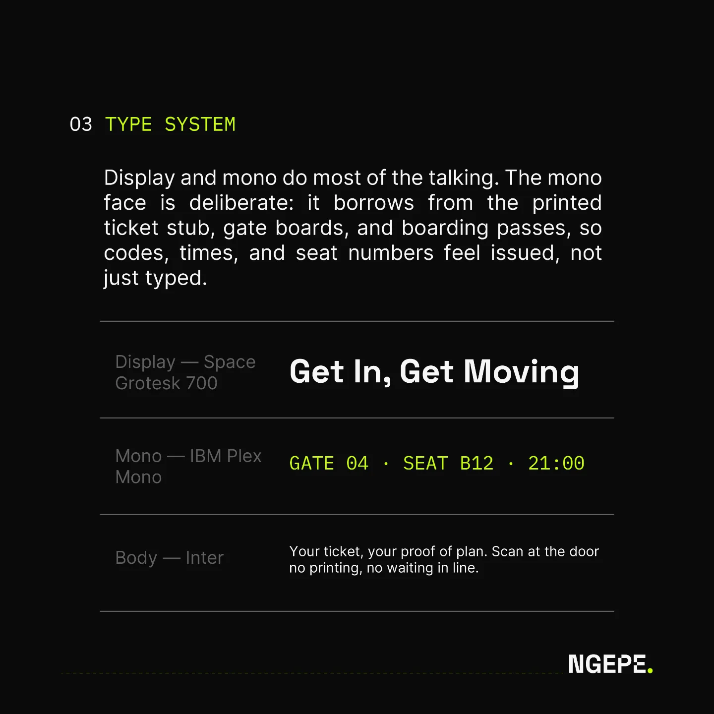
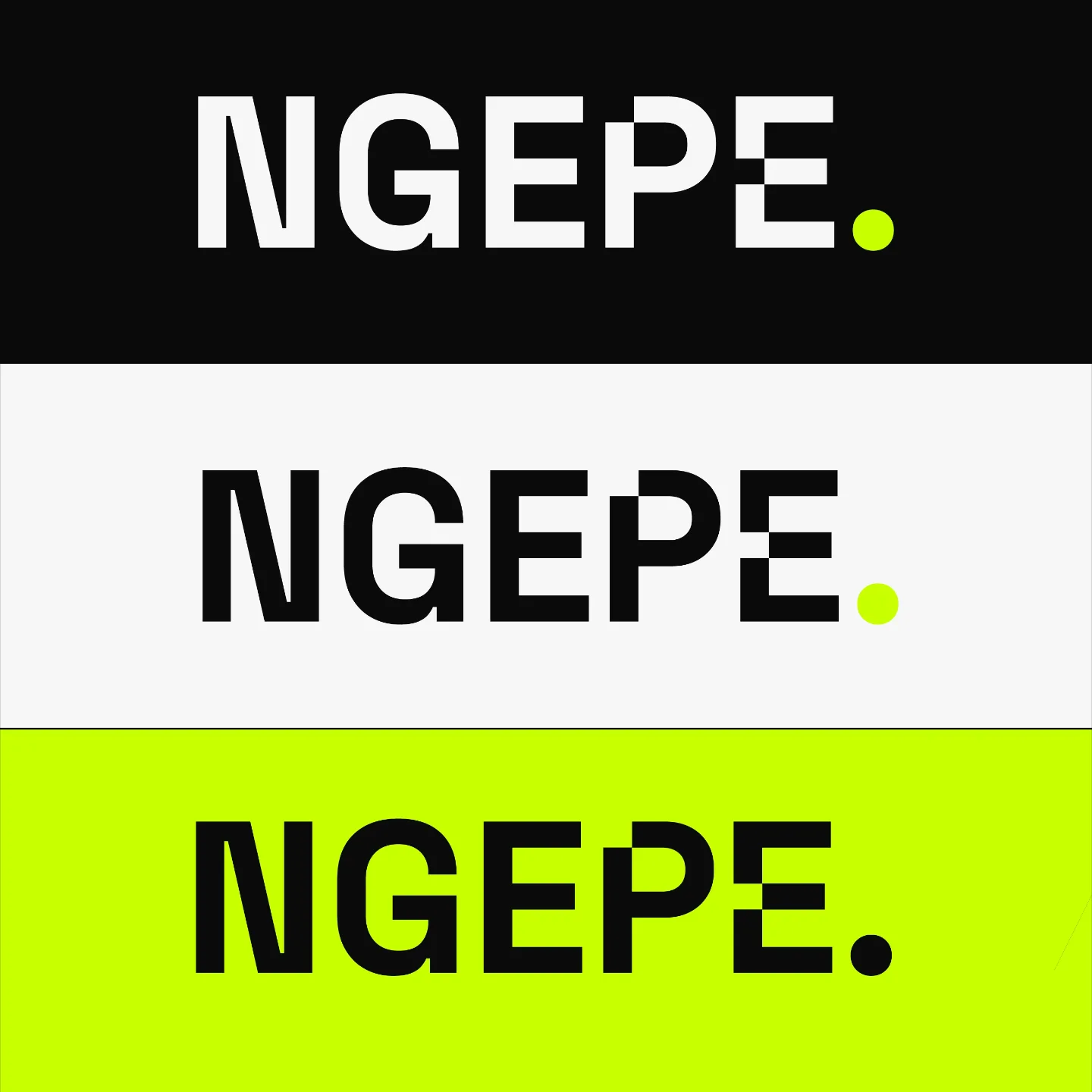
The wordmark is bold and compact, finished with a neon full stop that marks what's live, active or actionable. The palette is four colours used with intent, where neon is a signal, not a wash. A display face carries the headlines while a mono face borrows from printed ticket stubs, gate boards and boarding passes, so codes, times and seat numbers feel issued, not just typed.
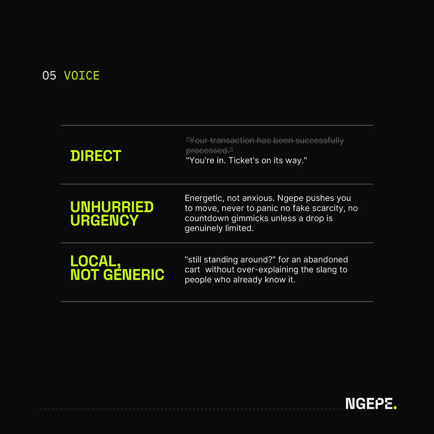
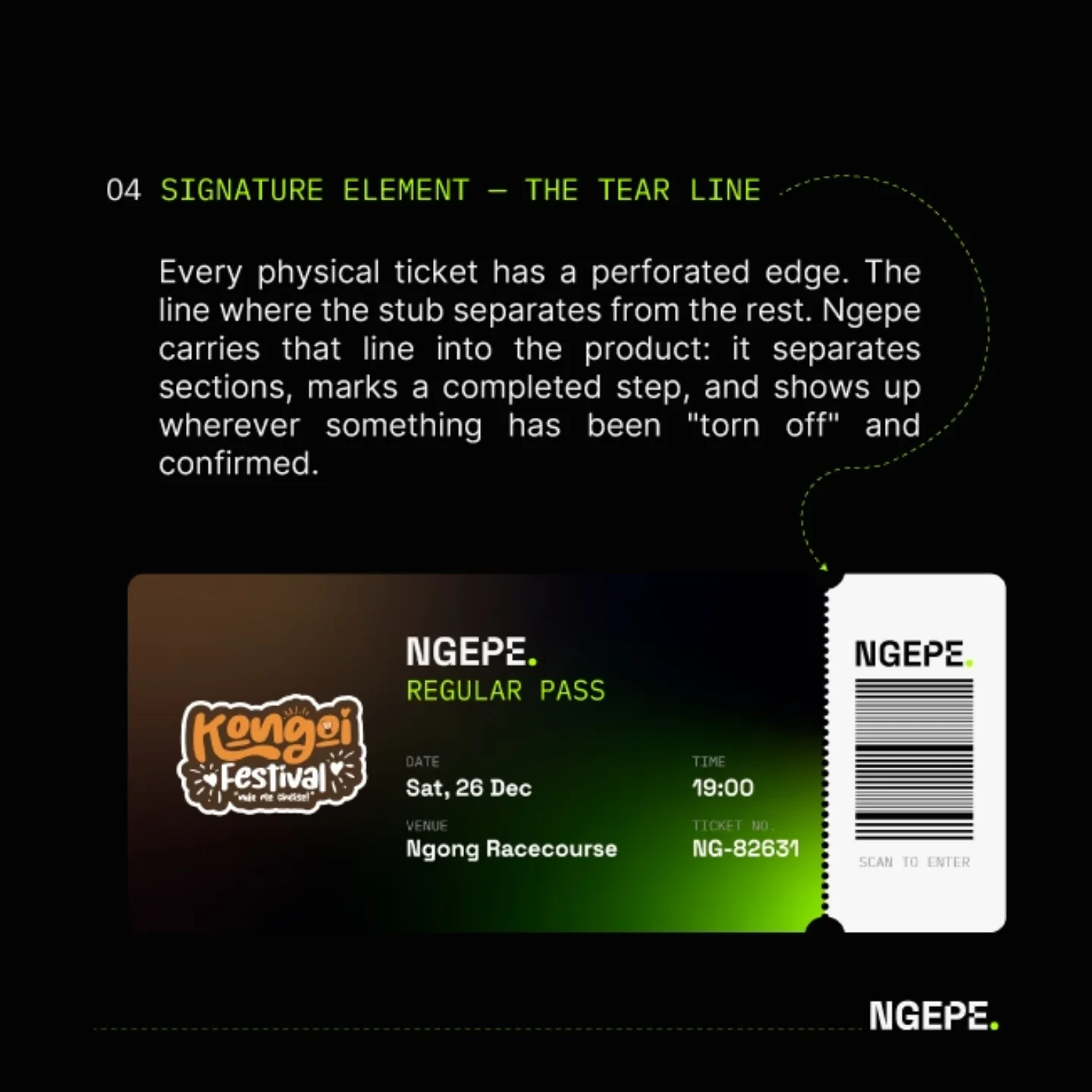
The signature element is the tear line: the perforated edge of a physical ticket, carried into the product to separate sections, mark a completed step and show up wherever something has been torn off and confirmed. The voice guide keeps it direct, local and urgent without the panic.