All work
Brand identity
Nex OS
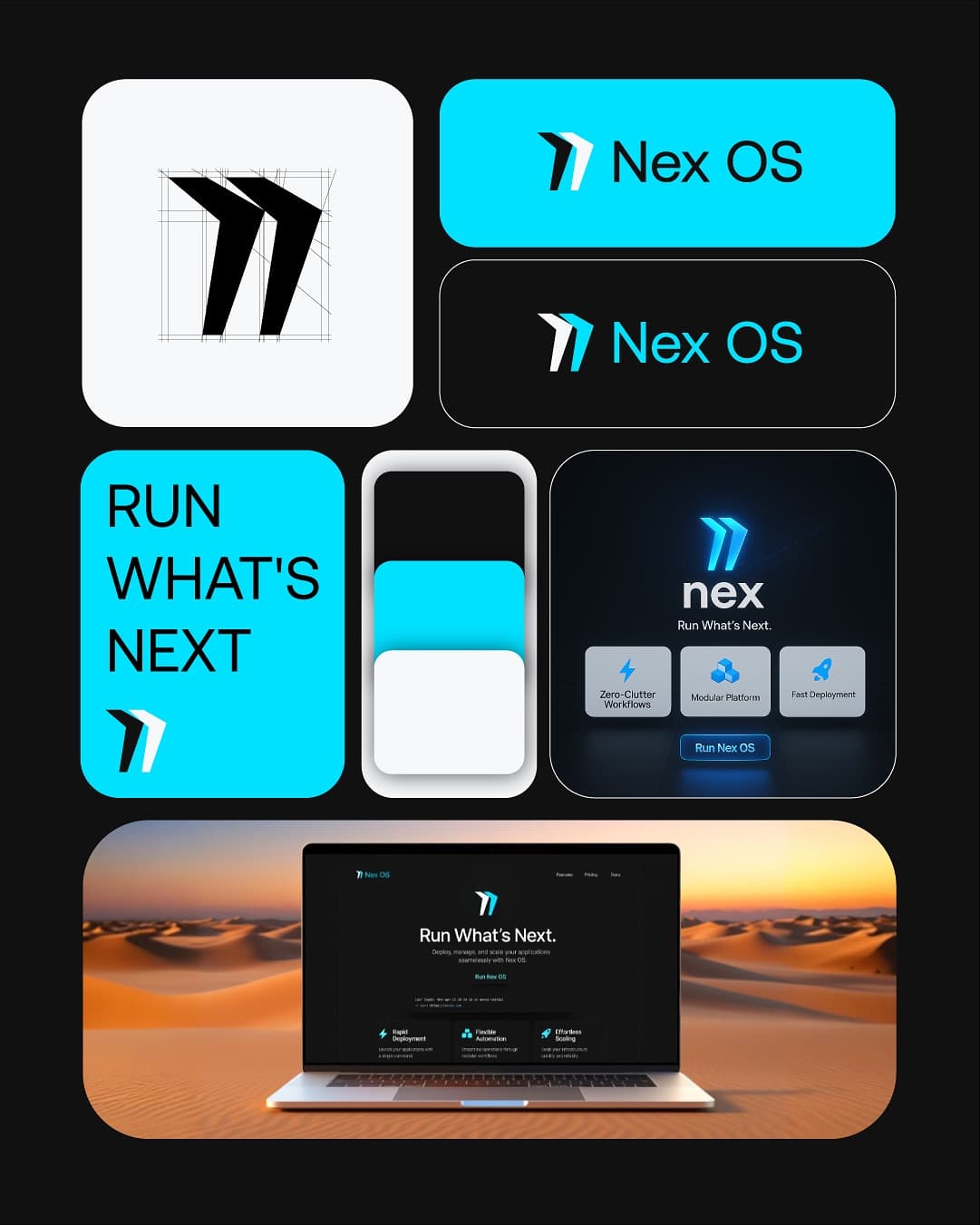
A sharp, forward-leaning identity for a software platform with one promise: run what's next.
- Client
- Nex OS
- Discipline
- Brand identity
- Year
- 2025
- What we did
- Logo, App icon, Landing page, Tech
Nex OS needed a mark that felt fast before anyone read a word. The symbol is two slanted strokes moving forward, built on a tight grid so it holds up at app-icon size and on a billboard alike.
We paired it with electric cyan on near-black, a clean geometric wordmark and the line "Run what's next", then carried the system through to the app icon, product cards and a landing page.