All work
Brand identity
Rustic Events
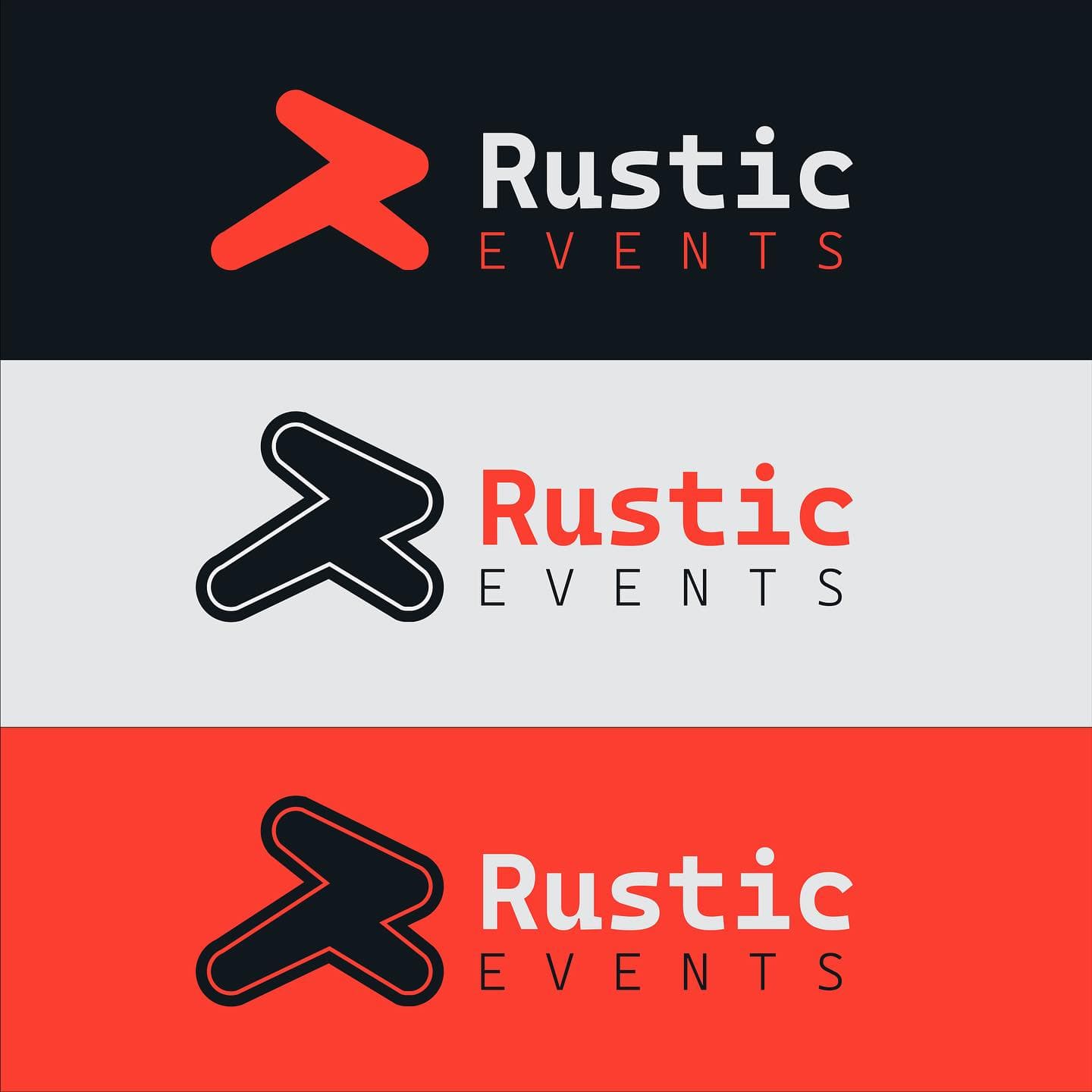
A bold, rounded logo for an events company, built to stand out on dark and light backgrounds alike.
- Client
- Rustic Events
- Discipline
- Brand identity
- Year
- 2023
- What we did
- Logo, Brand mark, Events
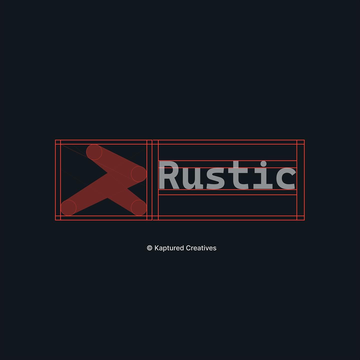
Rustic Events needed a mark with energy. The symbol is made from two rounded strokes that form an abstract R, like an arrow pointing to where the party is.
We paired it with a clean mono wordmark, tested it on charcoal, light grey and coral-red, and set it on a construction grid so it stays balanced at every size.